
Last week's post "Development emerges" zoomed in on one little girl in one little Himalayan village with a massively changed life. Positively beautiful! Let’s zoom back out now and look at all of humanity, the whole of the planet….
"Proof that life is getting better for humanity, in 5 charts"
shouts the headline of an article in Vox. Proving "...life is getting better for humanity..." seems way too complex for 5 charts, but author Max Roser is a clever economist at the Oxford Martin School's Institute of New Economic Thinking. I was keen to see how humanity looks in the light of his new economic thinking.
Roser opens with a recent survey showing few people think life is getting better (only 10% in Sweden, 6 % in USA, no opinion presented from any poor country). Then he hits us with a series of charts to prove how misguided those people are (he blames the media). His first chart is the proportion of the world in desperate poverty changing over time. The decline, dramatic since 1950 shows trickle-down isn't trickling. It's gushing. (Co-incidentally the 1950's, when modernism was booming, is when Truman "invented" the International development project.) Pockets of poverty notwithstanding life is better for nearly all seven billion of us. The rational economic men (I suspect Max Roser is one) were right- exponential economic growth has delivered development! Great news keeps coming in: education and health are massively better, freedom is up, fertility is down... and it's backed up with charts as compelling as the poverty one. Humanity's nirvanaward trajectory proved in five charts. Fantastic !

The first chart- dramatic and compelling. (the original is interactive)
For me. like Roser, people getting out of abject poverty is good. Much of my work is about this. However I dispute his claim that a binary "In extreme poverty=red/not in extreme poverty=green" chart and 4 other simple graphs "prove life is getting better for humanity”. Assuming his numbers are correct (and we'd want to verify them) all those pessimists are just plain wrong… else they're seeing stuff Roser and his data aren't talking about.
Can 5 charts capture sufficient dimensions of human life to prove that life is getting better? I think not. In my post clueless feedback I criticised a funder for making an NGO report just the number of richer people regardless of how their wealth was achieved. Here Roser presents narrow data in a crisp chart- how many people earn more than $1.90/day- as evidence of an improved life. Although nothing in the article supports the claim that being richer makes ones life better I can accept that for someone earning less than $1.90 a day almost any increase will improve their life. His data does not ask how the global economic-mlitary-political complex delivers that $1.90. Further the phrase ”is getting better” in his title projects a past trend onto humanity’s future. Even if his data "proves" life has got better, that does not logically mean it's continuing to do so. The environment might have something to say, so too global inequality, resource wars or international terrorism...
What Roser does not include in "proof that life is getting better..." troubles me much more than what he does.. His analysis omits the collateral damage the economico-politoco-miitary complex inflicted on planet and people even as it delivers $1.90 to many poor people …and hundreds of billions to a few rich people. Roser does not question that inequality either.
The environment is not in Roser's charts. In “clueless feedback” I questioned the significance for a Cambodian project of number of richer people if their wealth came by cutting their district's last patch of forest. I ask Max Roser what wealthier humanity means if our wealth comes from mining our planet's natural capital. Felling forests, pushing fisheries over tipping points, decimating biodiversity, poisoning ecological services with pollutants (e.g. CO2) are all wrapped up with the economic miracle Roser's article extols. Rising seas do not (yet) lap at Roser’s Oxford doorstep and global warming does not feature in his five charts but it already affects many people I work with. I promise you $ 1.90/day does not insulate indigenous Madhya Pradesh farmers against withering drought…
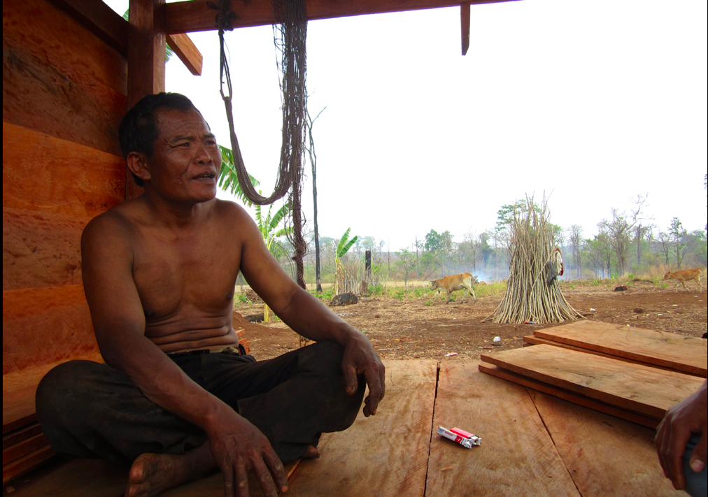
Life is getting better. Really! His ancestral forest lies as a smoking corpse around him and his community is in disarray- their language disappearing and children sniffing glue in town.. ..but the global market is flush with tropical hardwood, rubber and cashew nuts and this indigenous Cambodian lives on more than US$1.90/day.
Does income measure a better life? Roser** says “Yes”. The populations even of wealthy countries like Sweden and USA say “No”*. Is life better in a Cambodian village where some people have become wealthier, others have not and their unity has been lost? In their must-read book “The Spirit Level” authors Pickett and Wilkinson ask "Have we reached the point in human history when more equality is more important than more wealth?". Using solid epidemiological data they answer unequivocally “Yes”. Yet Roser affirms human life getting better wIthout reference to equality, GINI coefficients or wealth distribution. What you measure is what you see.
Perhaps Roser's concept of “Freedom" disturbs me most. Nobel prize wining economist Amartya Sen's essential work "Development as Freedom", defines development by the choices and opportunity life presents. In claiming freedom has increased Roser claims development. His evidence? A chart showing how many people live in a democracy. To me living in Western Democracy= free, Not in Western democracy =Not free is a dubious equivalence. Anyway how democracy is achieved is also important- Iraq, despite removing a dictator is as far as I can imagine from free governance, self-determination and just process. Lets also question what democracy delivers around the globe not just in its wealthy corners. Along with a green and pleasant life in New Zealand comes climate drought in Madhya Pradesh, India and wage slavery all over the Global South. The form of government preferred by the dominant West has not delivered freedom everywhere. "Extraordinary rendition" (aka kidnap) to Guantanamo Bay for life under the world's richest democracy and permanent member of the UN security council hasn’t increased anyone's freedom. Nor has freedom increased for an Iraqi woman who can now vote but whose public health service no longer vaccinates her children. Free USA and Britain invaded in defiance of UN resolutions and security deteriorated. Post-invasion the good citizens of USA and Britain freely voted their leaders back in. What does democracy actually deliver? Oil yes, but freedom? Not to a Madhya Pradesh mother choosing between selling her daughter to prostitution or watching her family starve. Free people in Western democracies making free choices in a free market are largely responsible for the carbon frying her land. For millions of workers around the world chained up in the cellar of the global economy the market may be free but they are not. Roser denies their stories by claiming proof of increased freedom in one, binary democracy chart.
What about ideological conflicts? Britain and USA recently launched national terrorist campaigns (i.e. unilateral, unprovoked wars using obscene high-tech weapons) to secure their oil, ensure only they have weapons of mass destruction and secure their economic ideology as the global paradigm. It's no co-incidence that atrocities like Korea, Vietnam, Nicaragua, Afghanistan and Iraq have come precisely during the period Roser's charts show the most dramatic "improvements". The Western economic miracle purrs along on political control underwritten by massive stockpiles of sophisticated weapons. It also directly benefits from profits and economic activity derived from clever people inventing, manufacturing and selling those weapons. On the other side radicalized men and women now brandish knives, shoe bombs and home-made explosives in support of their ideologies. The kind of violence that desecrated Manchester last week, even if minuscule beside Brtain's and USA's, is also grotesque. Roser's 5 slick charts assuage none of this. In the most militarized era of human history he wants me to see freedom increasing. I see a world in which power- unequally and unjustly, coagulated,-has unleashed psychopathic individuals and powerful nations to violate the rule of law.
You see what you look at. Roser, an economist, finds numbers that support the globally dominant world view. To be fair he does back up his five charts with links to more data. For example he offers a plethora of data on freedom but for me it is unidimensional, un-nuanced and mutely accepting of the dominant paradigm. There's an encouraging graph showing lynchings in USA decreasing to almost zero, but no data on police killings of unarmed blacks, extra-judicial drone killings, nor a chart of how civilian murders from helicopter gunships have changed over the last 200 years. I did not find figures on profit from arms sales nor an analysis of oppression and killings of Palestinians and other disempowered groups. The Vox article implies the ousting (if not the hanging) of autocratic Saddam Hussein is positive: Autocrat Removed+ Nascent Democracy Inserted = Increased Freedom. Simple! Roser's data does not move us to ask what democracy-inserted-at-the-point-of-invaders'-guns means, nor why Blair and Bush are still at large in our leading democracies. Based on standard, old-fashioned human rights measures Roser says the situation has improved. In a world where a new human rights abuse of the poor is death-by-greenhouse gas we desperately need new thinking, new ways to interrogate and present data. I did not find it. I looked for interactive world maps like "Who makes CO2 and where, who dies and where" or "Who makes arms and profits, who's killed and how". I did not see them. I saw only what Roser's microscope makes visible, through an ideological lens ground out of old thinking and economics that has failed the environment and most of the planet's poor people.
For me outcomes measure development. Outcomes: How human beings behave, how we relate to each other, our attitudes and our policies. Outputs like numbers of children vaccinated might be a way to get to outcomes but are not in themselves development. Nor are impacts (like global fertility rates). Impacts are the effect of development. Presenting impact, Roser is measuring by effect so I want him to present effects from many sides. I do not reject his claim "life is getting better", just say that we need a much wider range of creatively linked data to prove it. Give me some new thinking. Show me both what the western economic-military-political complex has delivered to humanity and what it has inflicted on us and let me decide. Yes, enumerate how many people now live on more than US$1.90/day- it's an important dimension of human well-being- but integrate that with climate change, resource wars, global literacy, crashing biodiversity, inequality, environmental degradation, fertility, sporadic Islamic terrorism, massive Western terrorism, an analysis of UN security council permanent member vetoes blocking global justice.... Perhaps the pessimistic populations Roser started with are integrating all that complex stuff. Roser isn't.**
PS. On 28 July. 2017 this piece by Oliver Burkeman appeared in the Guardian. It is a nuanced exploration of similar issues and quotes Max Roser's research. You can listen to the podcast of this article here:
*I accept that the poorer someone is, the more important a small, immediate, incremental increase in income is for to them
** referring only to the Vox article content, not the author personally.